Design System
Designed and scaled a unified design system to restore structural coherence across fragmented AI products.
Transformed a growing component library into a governed, cross-functional product infrastructure.
Reduced developer page-building time by 75% and accelerated design delivery from one week to half a day.
Scope
- Branding and visual identity alignment
- UI component architecture
- Layout and grid system definition
- Design tokens and naming protocols
- Documentation and governance guidelines
- Developer integration and cross-team adoption
My Role
- Defined strategy and roadmap for system-wide implementation
- Directed the creation and evolution of components, patterns, and standards
- Established naming conventions and token structures
- Maintained accessibility and system integrity
- Conducted audits to ensure behavioral and visual consistency
- Validated system logic through usability research and testing
About Project
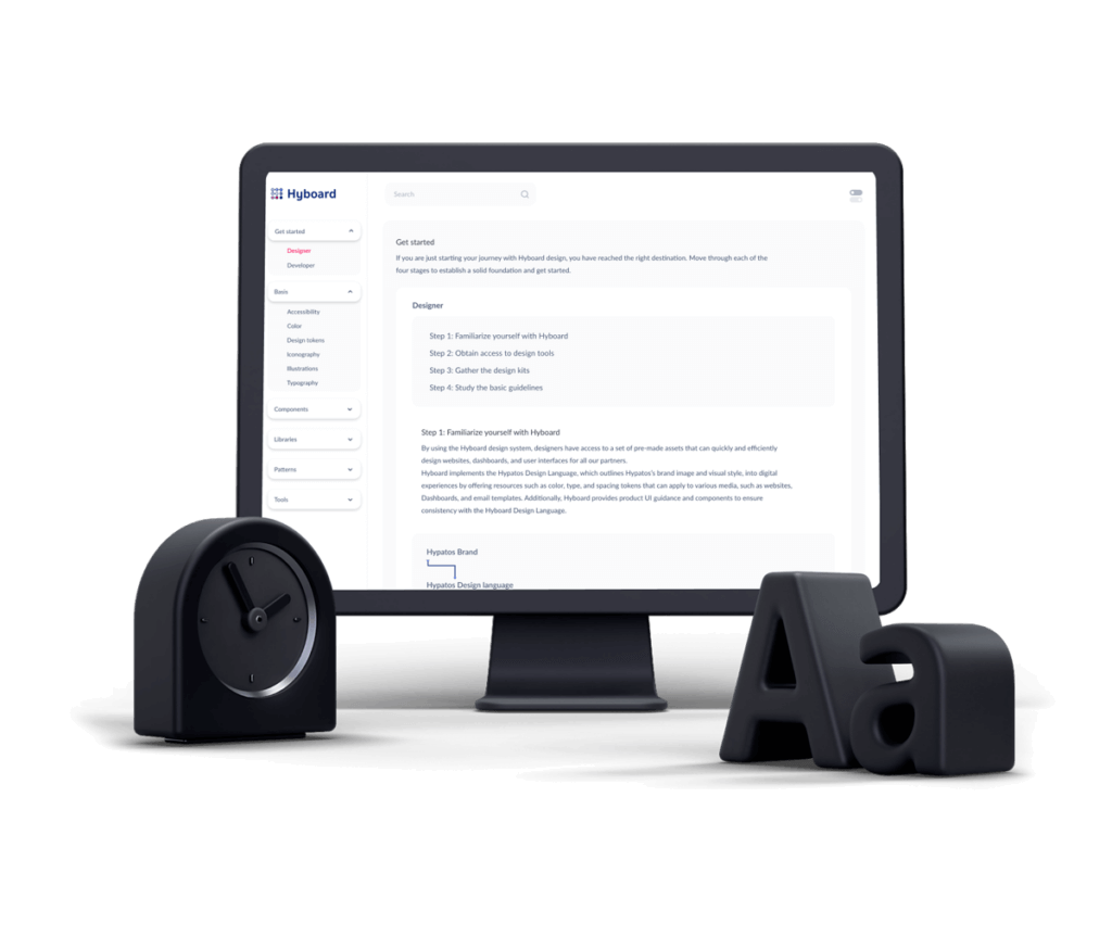
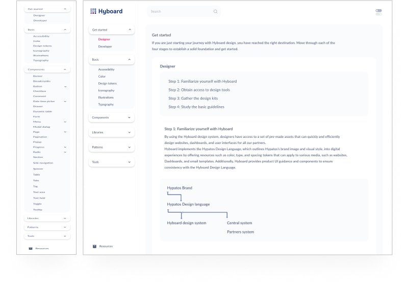
HyBoard was developed as a standardized design ecosystem: a structured collection of adaptable UI components, interaction patterns, and governance rules. It was not merely a UI kit – it was a coordination mechanism aligning design, engineering, and product logic across expanding AI platforms.
The Challenge
As Hypatos scaled, multiple teams reused and modified an early component library.
Without centralized governance, components diverged in behavior, naming, and structure, creating inconsistency and technical debt.
The problem was not aesthetic inconsistency — it was systemic fragmentation.
The objective was to establish a single authoritative source for design logic, improve cross-team efficiency, and ensure long-term maintainability.
Key Questions
- How do we create a single source of truth across products?
- How do we enforce consistency without slowing innovation?
- How do we reduce duplication across design and engineering teams?
Discovery & Alignment
- Designers reported repeated rework due to low visibility into reusable patterns.
- Developers struggled with version control, inconsistent breakpoints, and duplicated logic.
- A lack of shared terminology created friction across teams.
- The design system needed to function as both a visual language and a shared organizational vocabulary.
Design Process
- Conducted a full design audit across products
- Assessed long-term scalability and governance needs
- Interviewed leadership (VP, CTO, Product) to align on strategic objectives
- Defined naming conventions prior to token creation
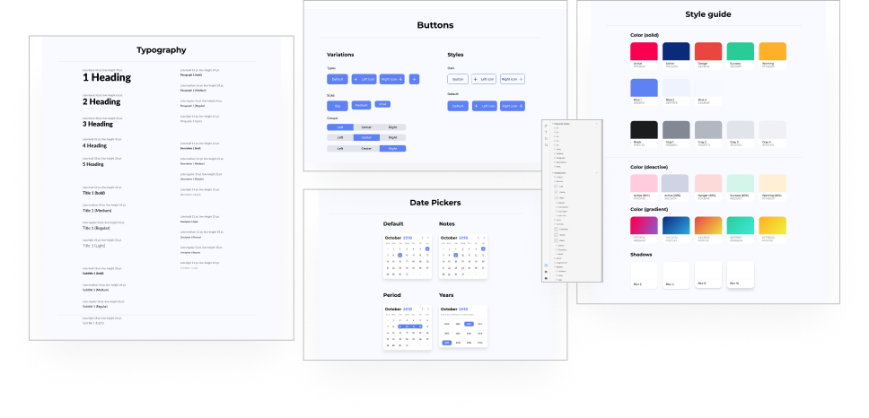
- Structured tokens for color, typography, spacing, and layout
- Documented usage principles and behavioral expectations
- Integrated accessibility standards from the outset
- The system was designed for evolution, not static delivery.
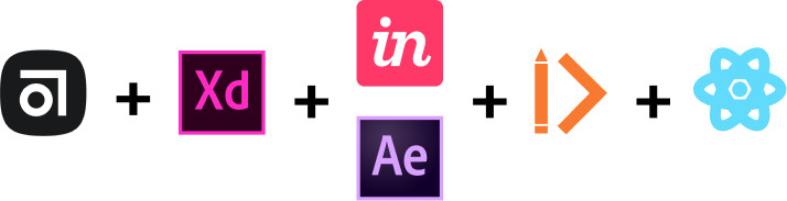
Design Approach & Tools
Through workshops, I aligned teams on workflow, grid systems, breakpoint logic, and handover protocols.
We structured the system using Atomic Design principles while adapting terminology to match internal language.
Shared libraries and version control tools were introduced to eliminate duplication and fragmentation.
The result was a customizable UI foundation aligned with both design logic and React-based development workflows.
Standardized Design Language
We initiated the process by categorizing elements into Atoms, Molecules, Organisms, Templates, and Pages, as the Atomic design methodology was already familiar to the team. Additionally, the adoption of React as the JavaScript library by the development team also facilitated our alignment, as we all approached the project with the idea of constructing intricate interfaces using smaller building blocks.
Next, we conducted user testing of this grouping with external designers and product owners to guarantee a seamless handover for any team taking on a new project.
We gave each user a list of components of varying complexities (e.g. button, header, data extraction, data points, etc.) and asked them where they would anticipate finding these.
Our categorizations were not as intuitive as we initially thought when differentiating between molecules and organisms.
We experimented with a different grouping system based on the terminology already utilized within the company. Styles included typography, colors, and grids, while elements included atoms, molecules, and smaller organisms.
Larger organisms were placed under the category of components. Data Cards had their separate section, as did all elements related to a document extraction.
This terminology update received positive feedback from stakeholders, and I would have liked to have refined it further with the engineering team’s participation.
Documentation & Governance
Well-written documentation outlines and communicates the visual design, user experience, engineering principles, and a standard design, development, and feature governance process. This helps internal and external teams to efficiently adopt the platform and work together harmoniously.
HyBoard was designed to be customisable, offering multiple variations of each component to ensure a streamlined and clean library. Designers can remove any version that does not align with their brand. The UI kit includes clear explanations for design decisions to help designers understand their reasoning. It’s important to highlight what is fixed and the potential consequences of changing certain aspects, as everyone has their approach to work and shortcuts.
The engineering lead and I collaborated with a technical writer to ensure all documentation was comprehensive and easy to understand. The design system’s homepage provides two access points, one each for designers and developers. These guidelines have been designed to be concise and relevant to the target audience.
FINAL OUTCOME
- The Hyboard design system combined the XD UI kit, React components, design principles, development values, and usage guidelines for the Atomic partner’s web platforms, resulting in consistent experience, accessibility, and performance standards for all new products.
- The system’s initial launch revealed a significant improvement in page-building time for developers, with a decrease of 75%.
- This also reduced the time it took for our designers to wireframe a partners responsive dashboards from a week to just half a day. By adopting the Hyboard design system, the team was able to quickly prototype new features, streamline the onboarding process for new designers and developers, and hasten the handover process.
Related Case Studies
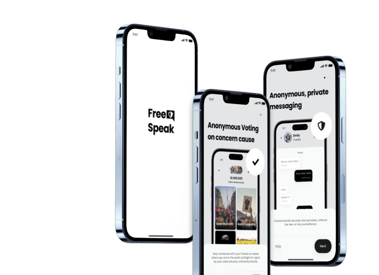
FreeSpeak
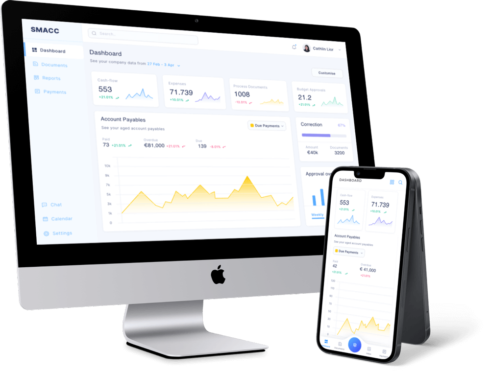
SMACC
SMACC is streamlining financial and accounting tracking with Real-Time monitoring of Incoming Invoice Processes.